NACHTHEXEN
Animated Short Film Released January 2017
Nachthexen has screened at more than 20 festivals and won 3 awards;
The Super 8000 Rethink Award. (Denmark).
Monstra’s Youth Jury Award. (Portugal).
The One-Reeler Short Film Competition Special Merit Award. (Los Angeles).
Director: Julie Baltzer. Art Director & Development of Visual Style: Nadia Ørneborg. Graduation film created by a core team of 7 people.
In ”Nachthexen” the 2 main characters gradually discover the dissonance between the propaganda they grew up with and the gruesome reality of war.
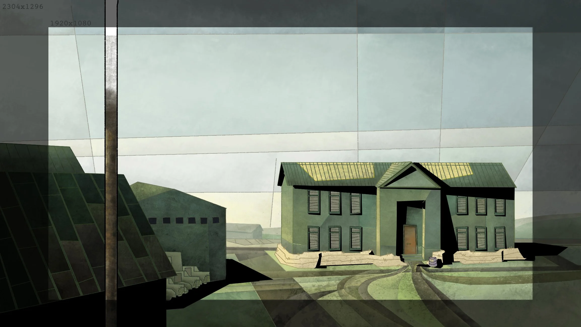
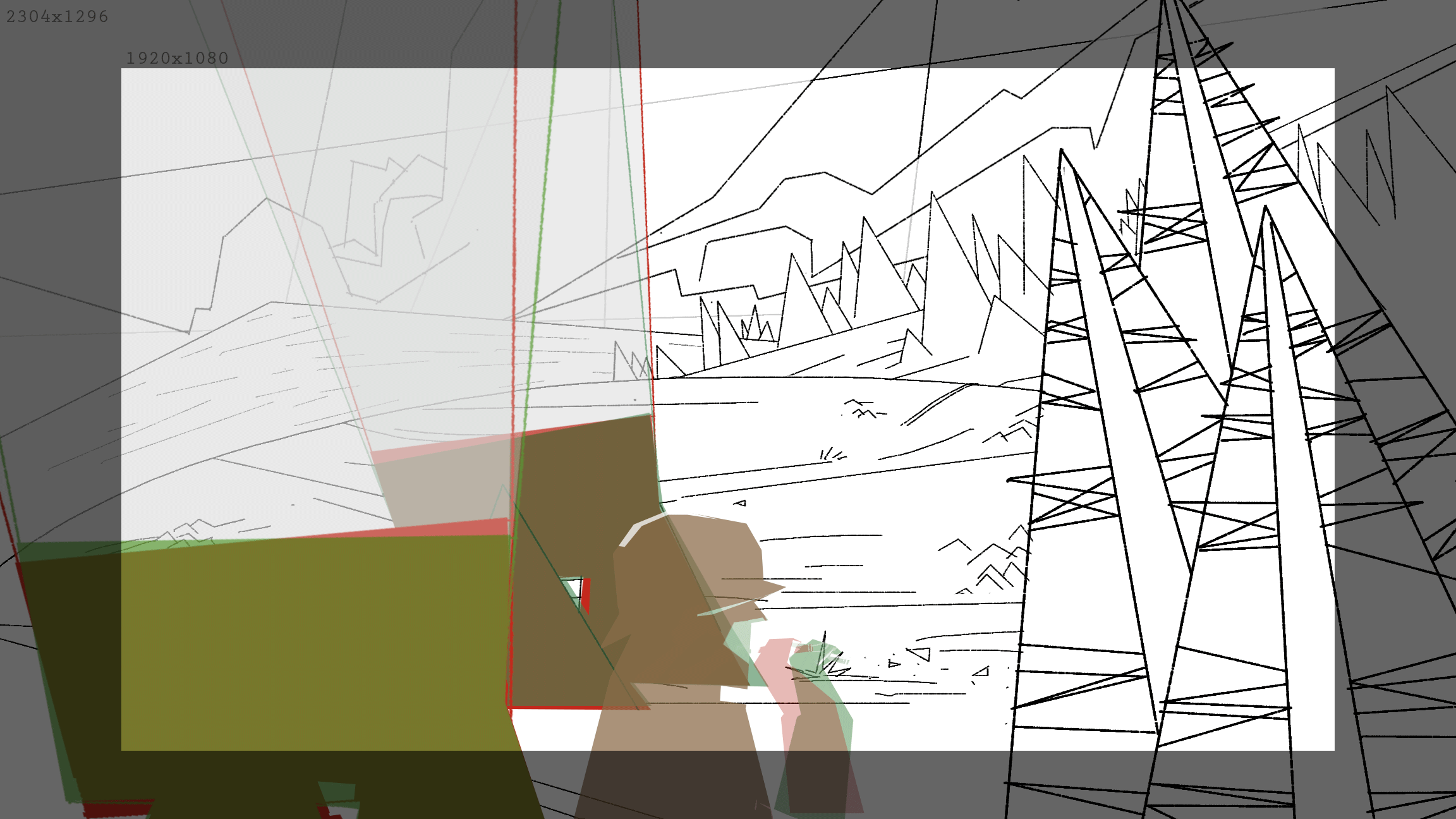
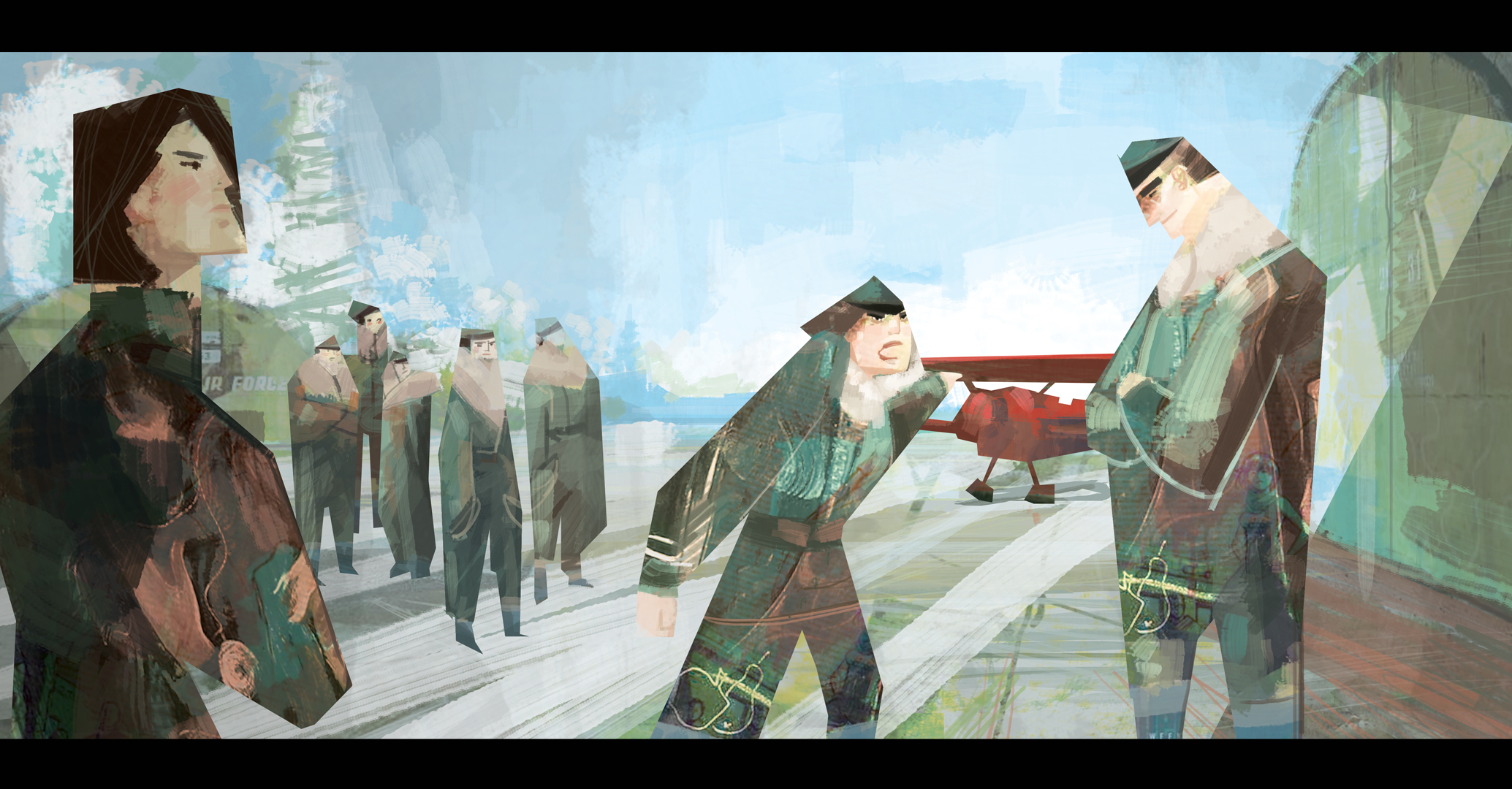
In the film we follow a squadron of soviet night bombing pilots training and operating at the German front during WW2. Nicknamed “Nachthexen” (Night Witches) by German soldiers because of the sound made by the canvas wings on their old planes, the women would turn off their engines mid flight to glide unseen towards their targets.
The film is based off of real women pilots and their very real methods.
INTENTIONS & THOUGHTS BEHIND THE STYLE OF NACHTHEXEN
I always aim to make the visual expression support the story in the projects I work on.
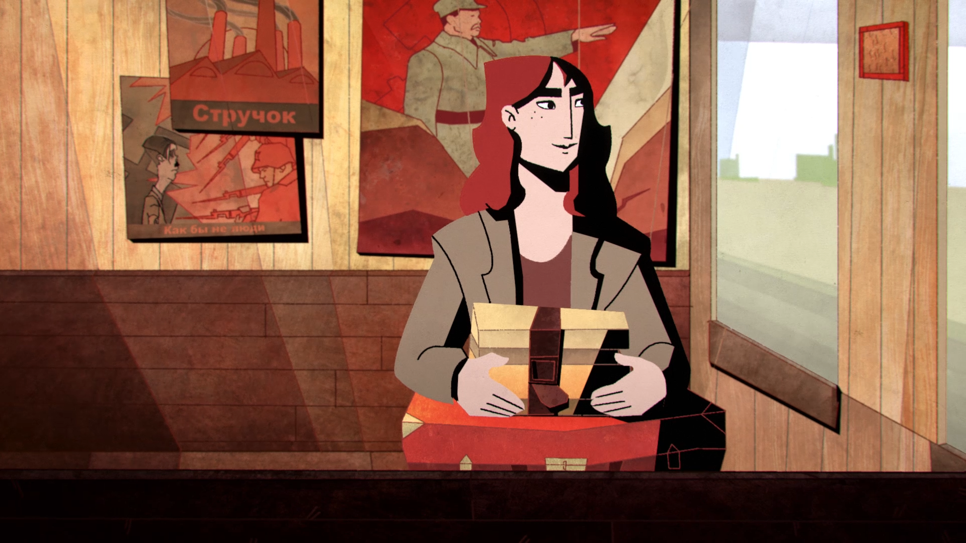
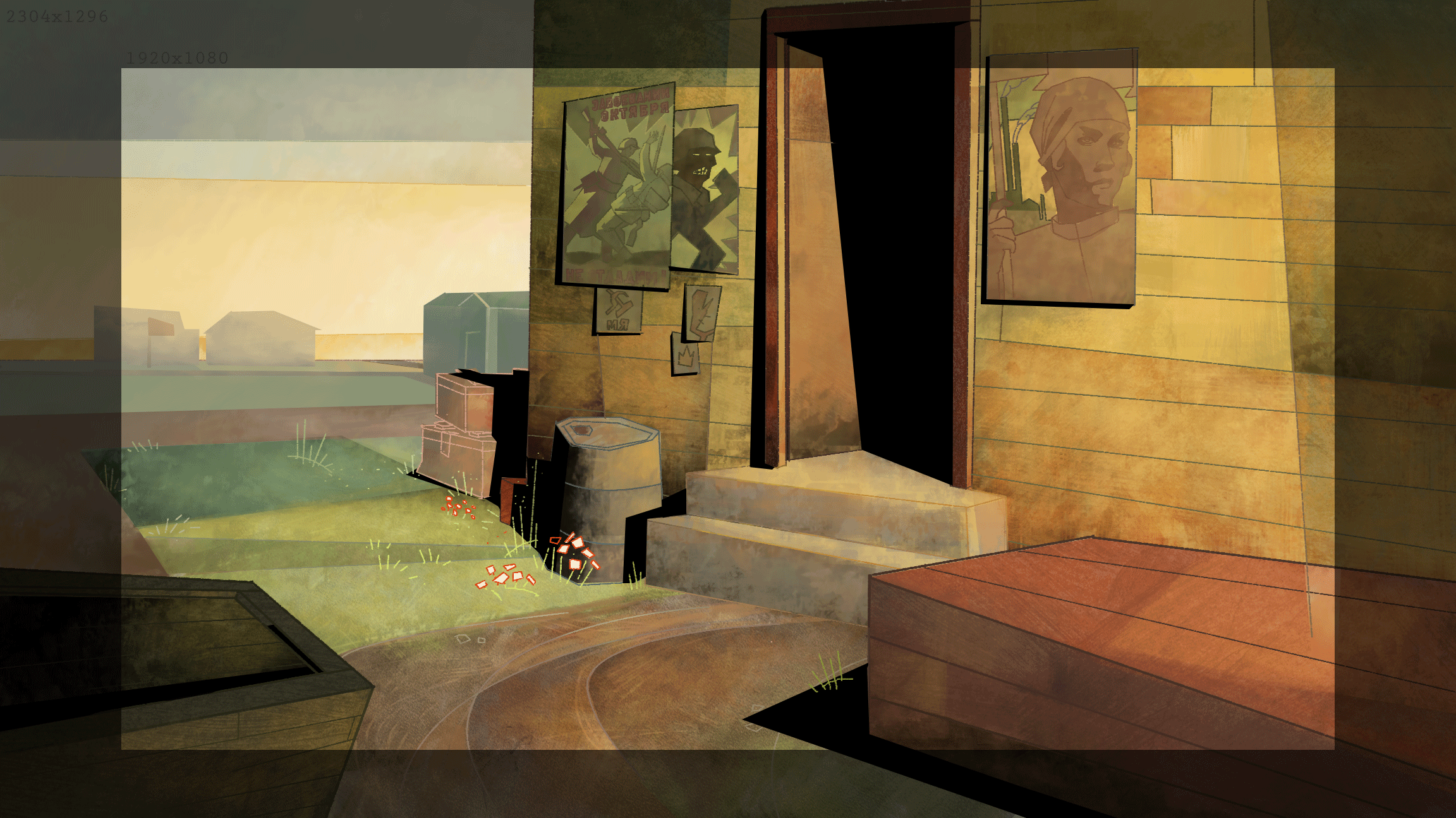
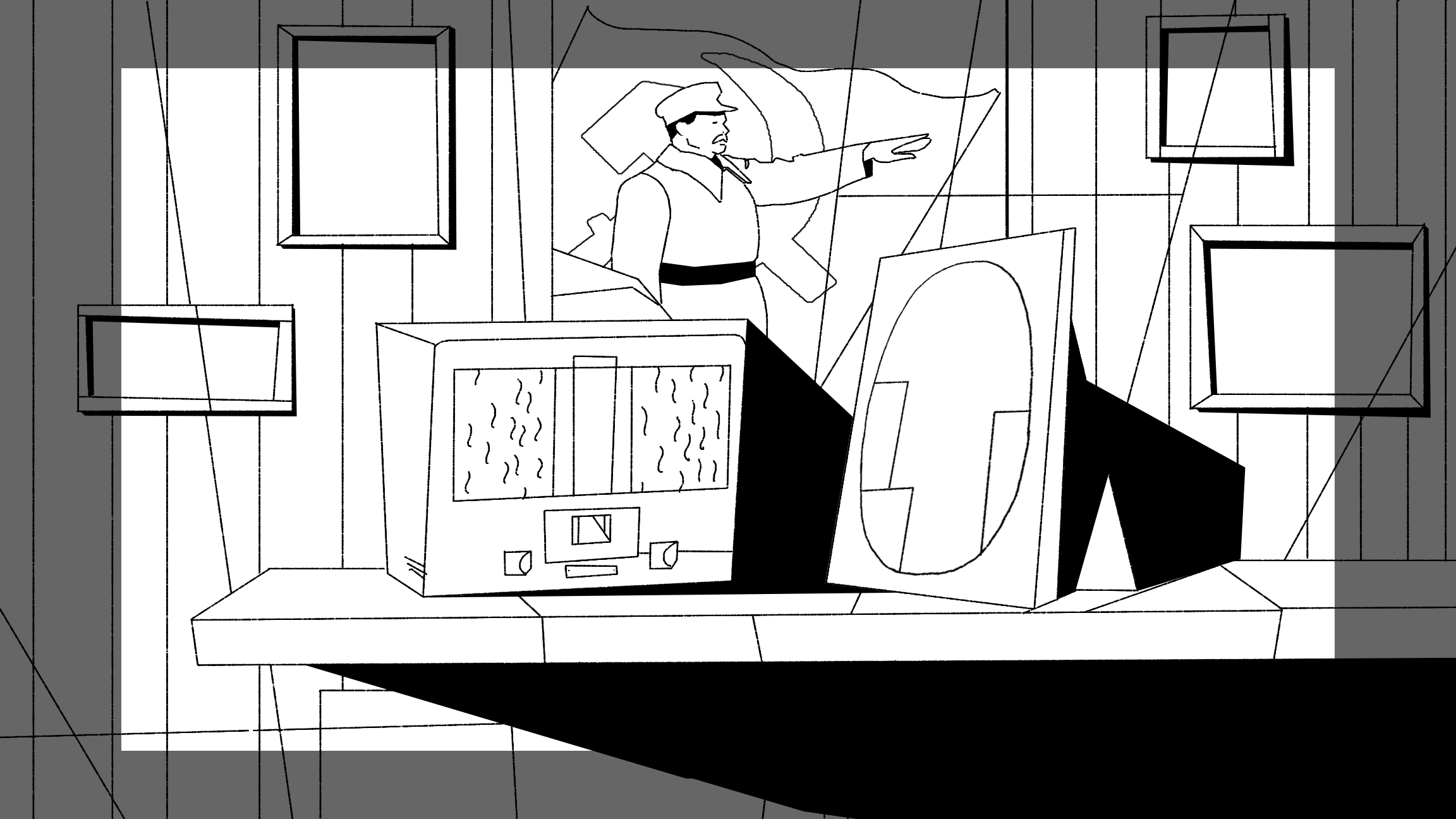
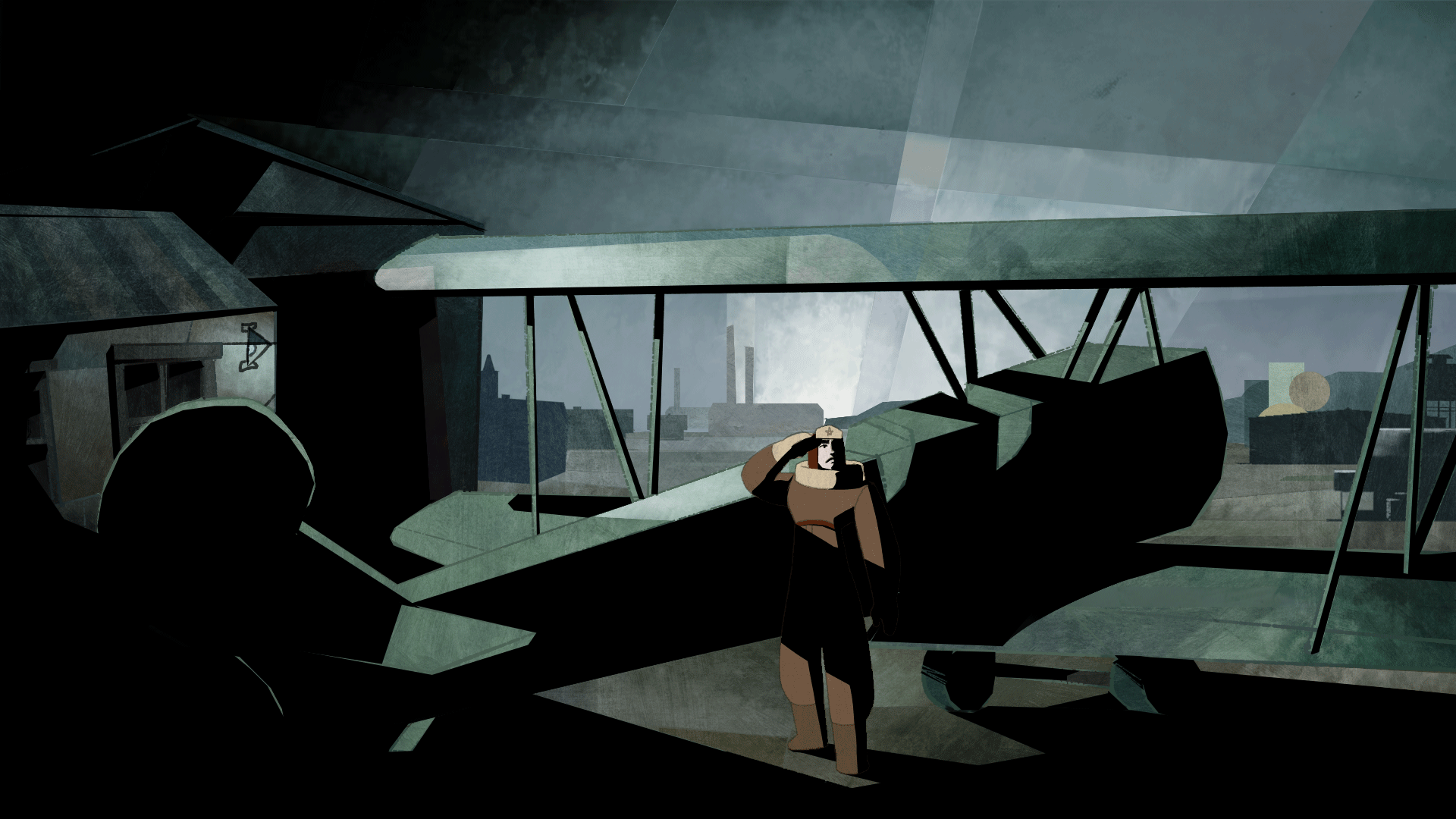
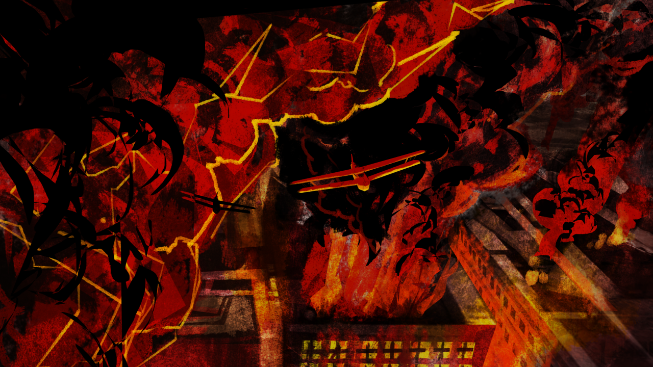
For this project I chose to take inspiration from Precisionism and WW2 propaganda posters.
I did this to give the viewer a feeling of the time period we are in as well as the main theme of the film; the stark contrast between idealised propaganda and the reality of war.
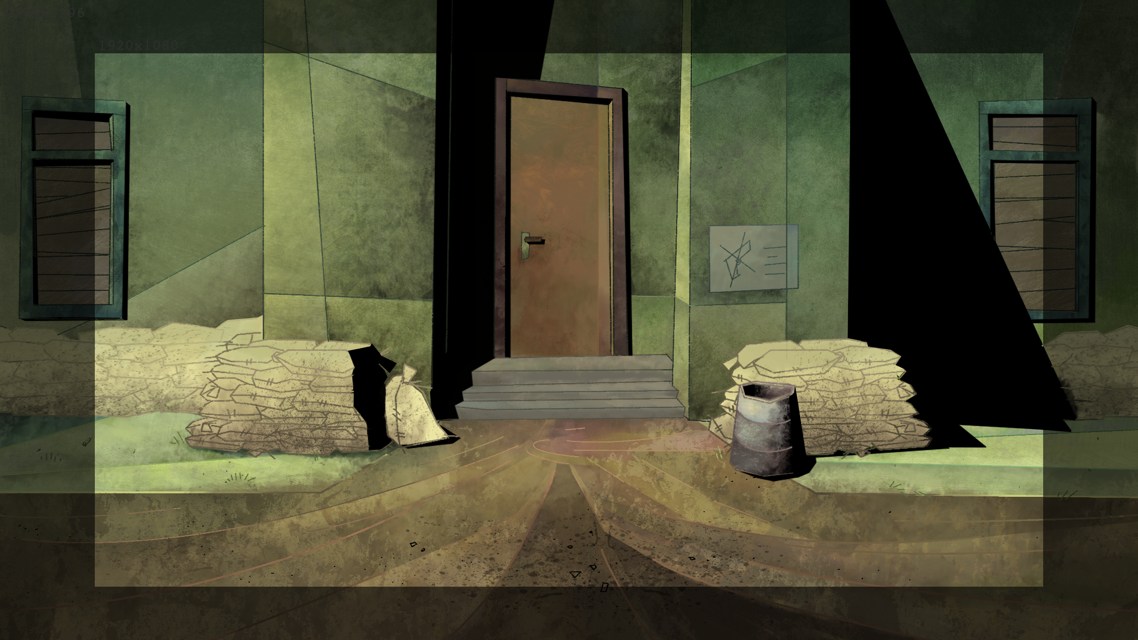
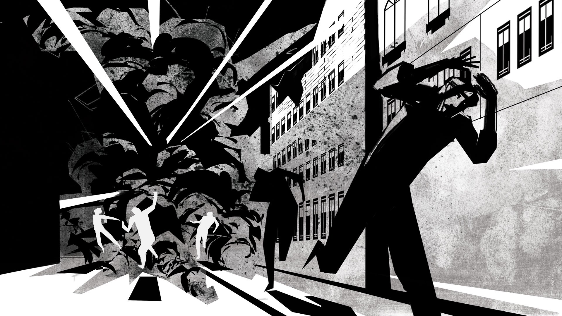
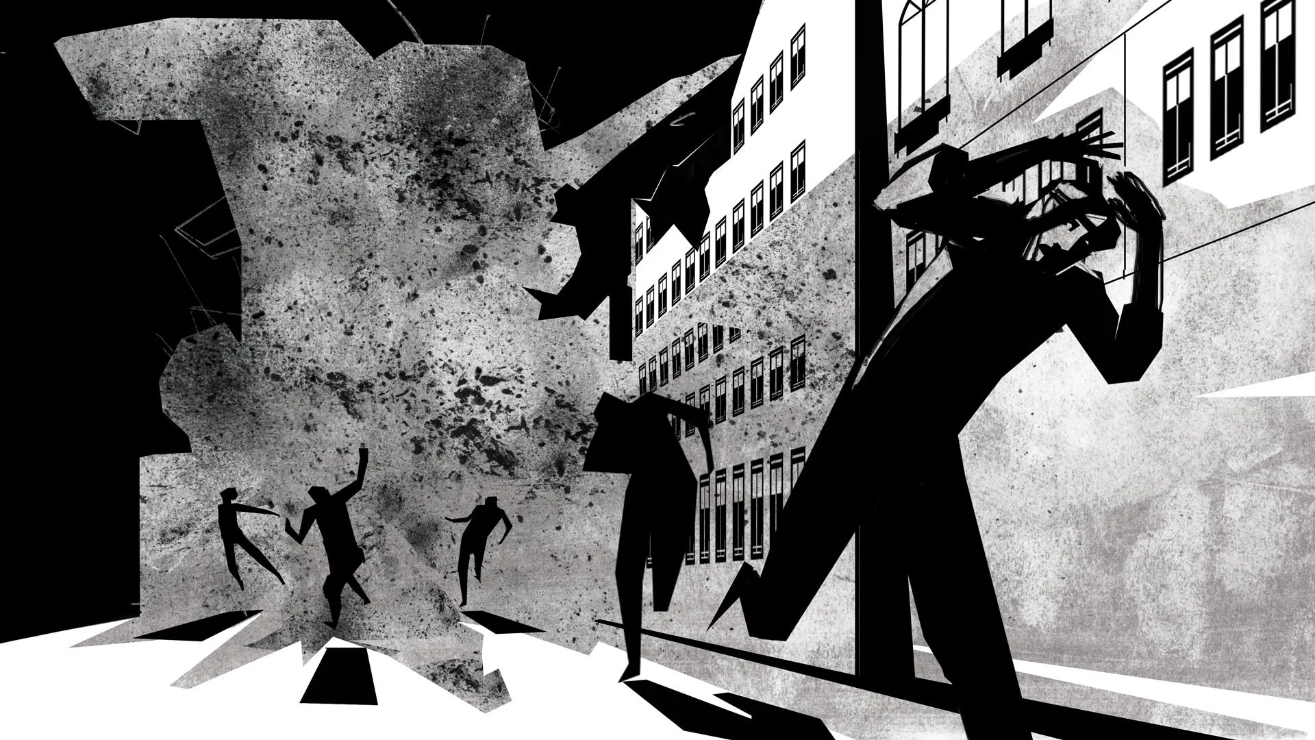
Even though Precisionism is an American art movement, it has many similarities to the Constructivist architecture of the Soviet Union pre WW2 and I found it incredibly suitable to visually express the world the characters would have grown up in. At the same time, it would allow me to play with a sharp and square shape language to portray the rigid, military confinements they’re in.
Choosing Precisionism - a quite stylised art movement - for this film was also purposely done as an active comment and small defiance towards the Stalin regime and its strict censorship of artists in the country, deeming anything but Social Realism culturally acceptable.
Colours, character designs, shape language, compositions, camera language and animation style. All was developed with the story and its unfolding in mind. Together it gives a depth to the finished piece that might not be seen at first glance but is most definitely felt.
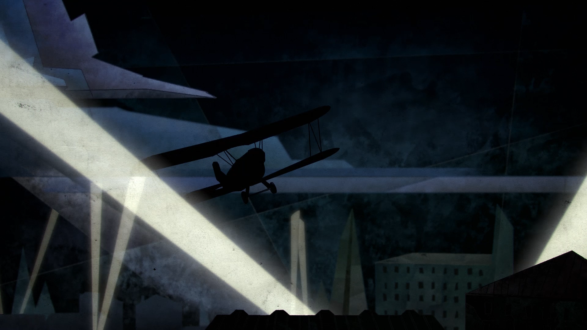
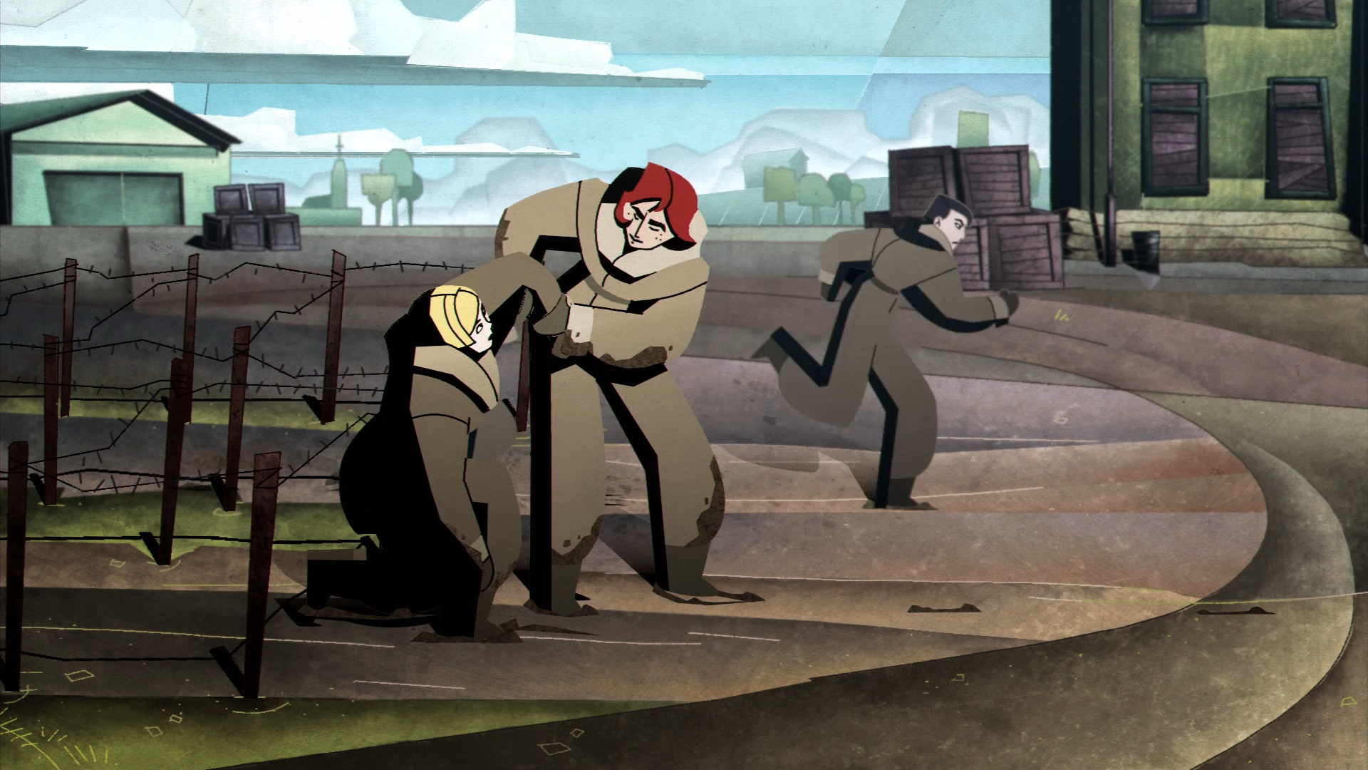
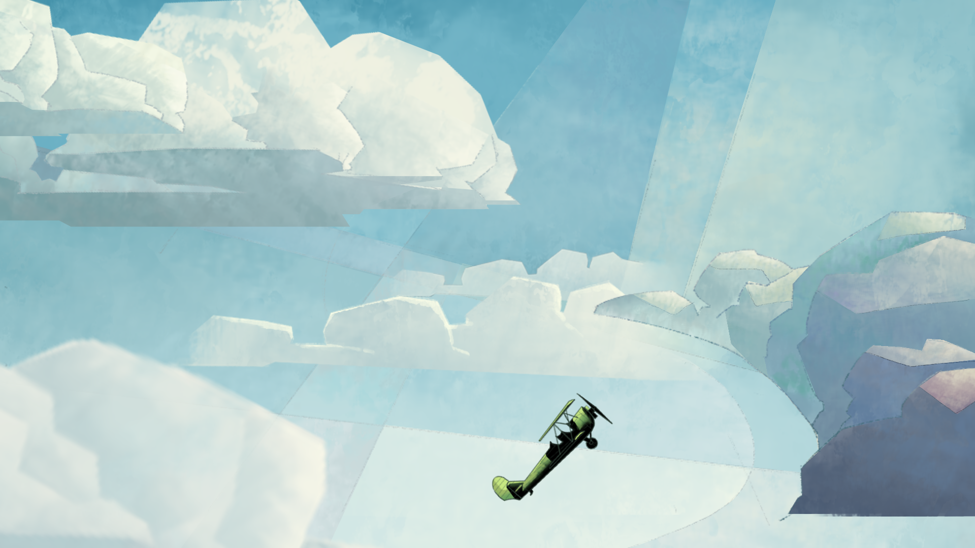
To create contrast between the characters’ emotional states on the ground vs. in the air I worked with the concepts of heaviness and lightness.
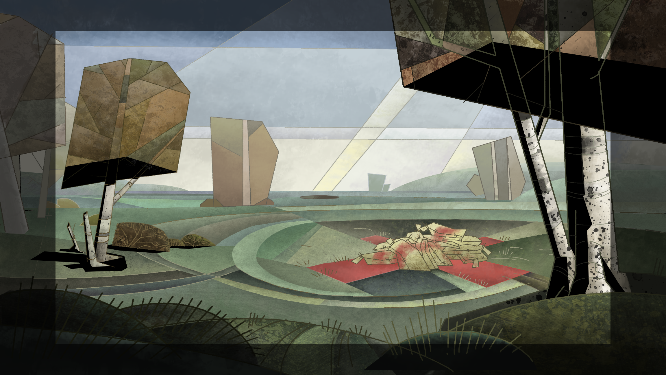
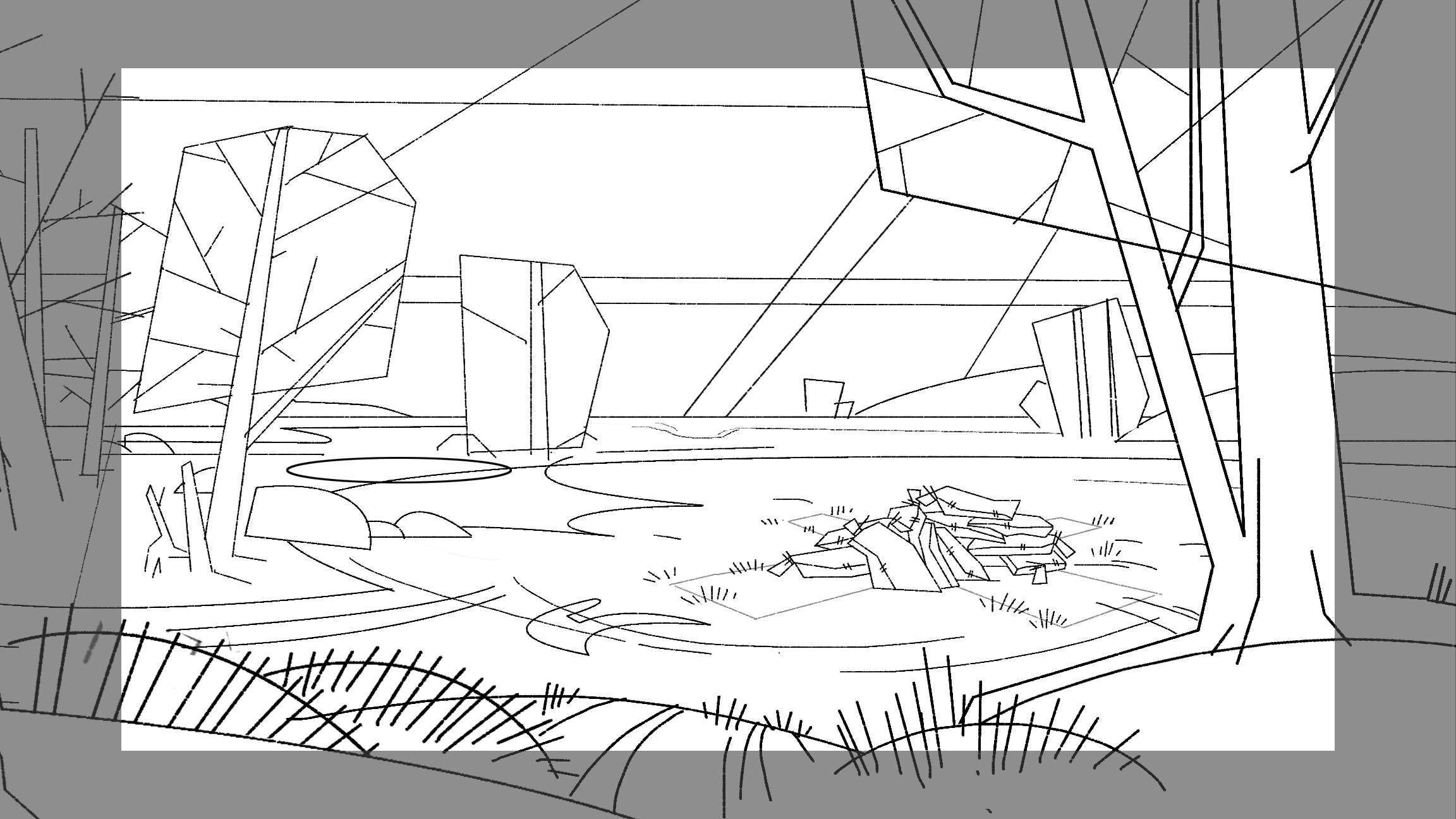
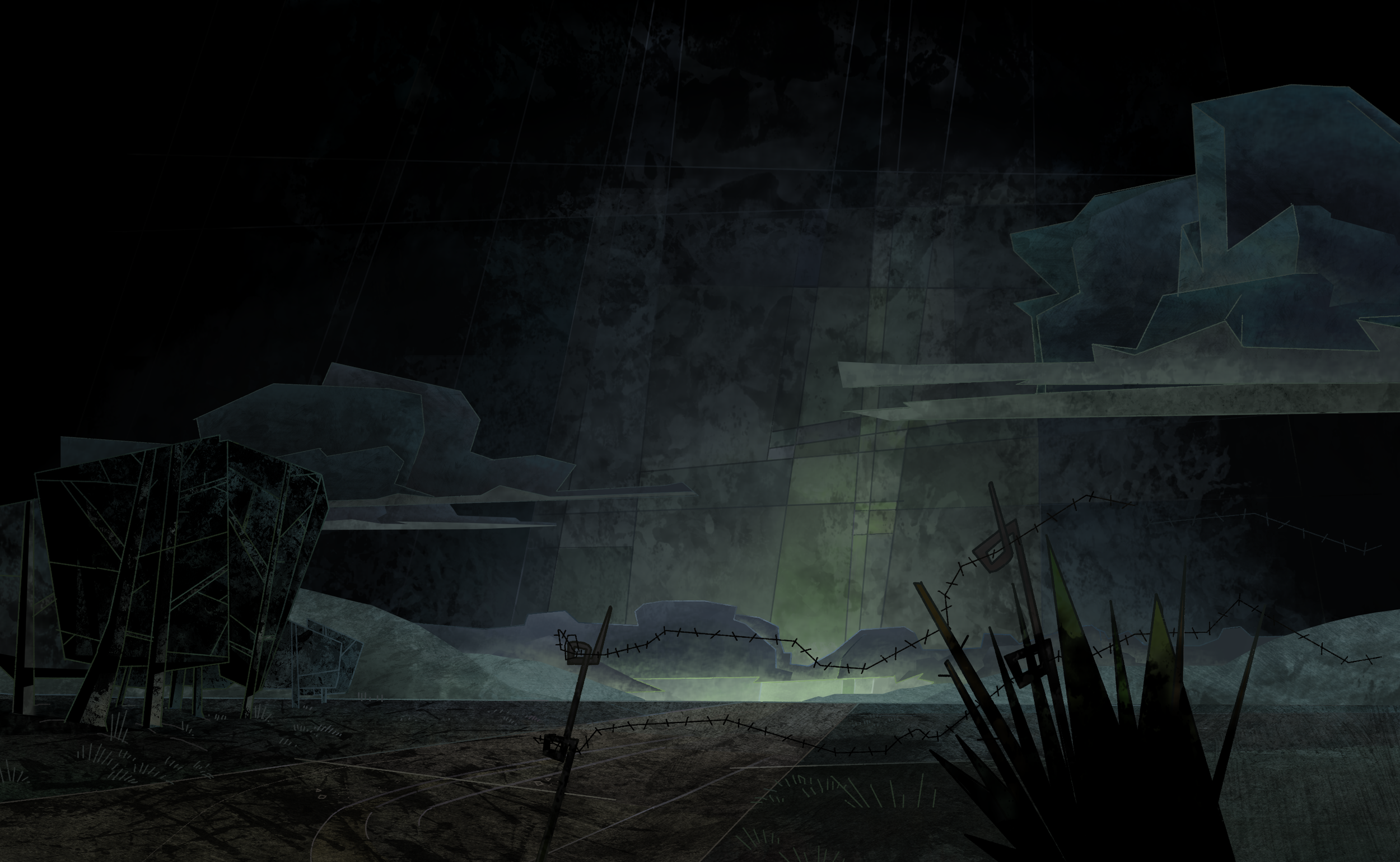
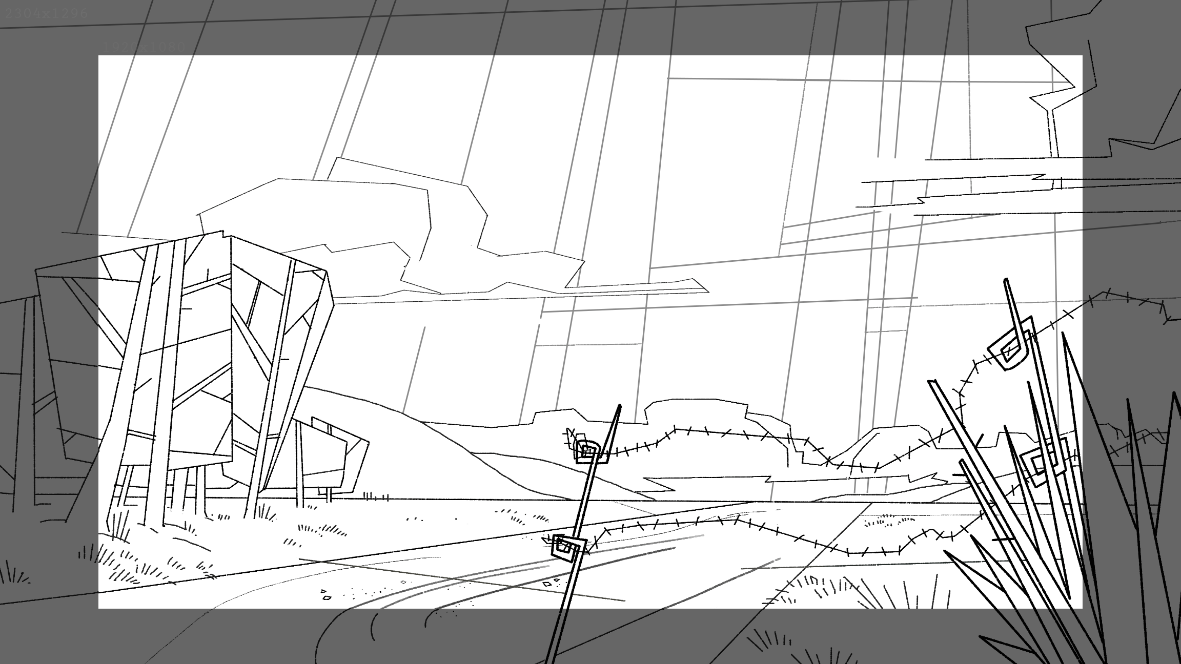
The animation style was purposely created to make the characters movements feel heavy when on the ground. Compositions and camera language as well, using flat angels and high horizon lines during training and low or no horizon lines during moments of flying or high anticipation.
Lines in the backgrounds were used to “box in” and create “obstacles” in movement and express increasing or decreasing chaos.
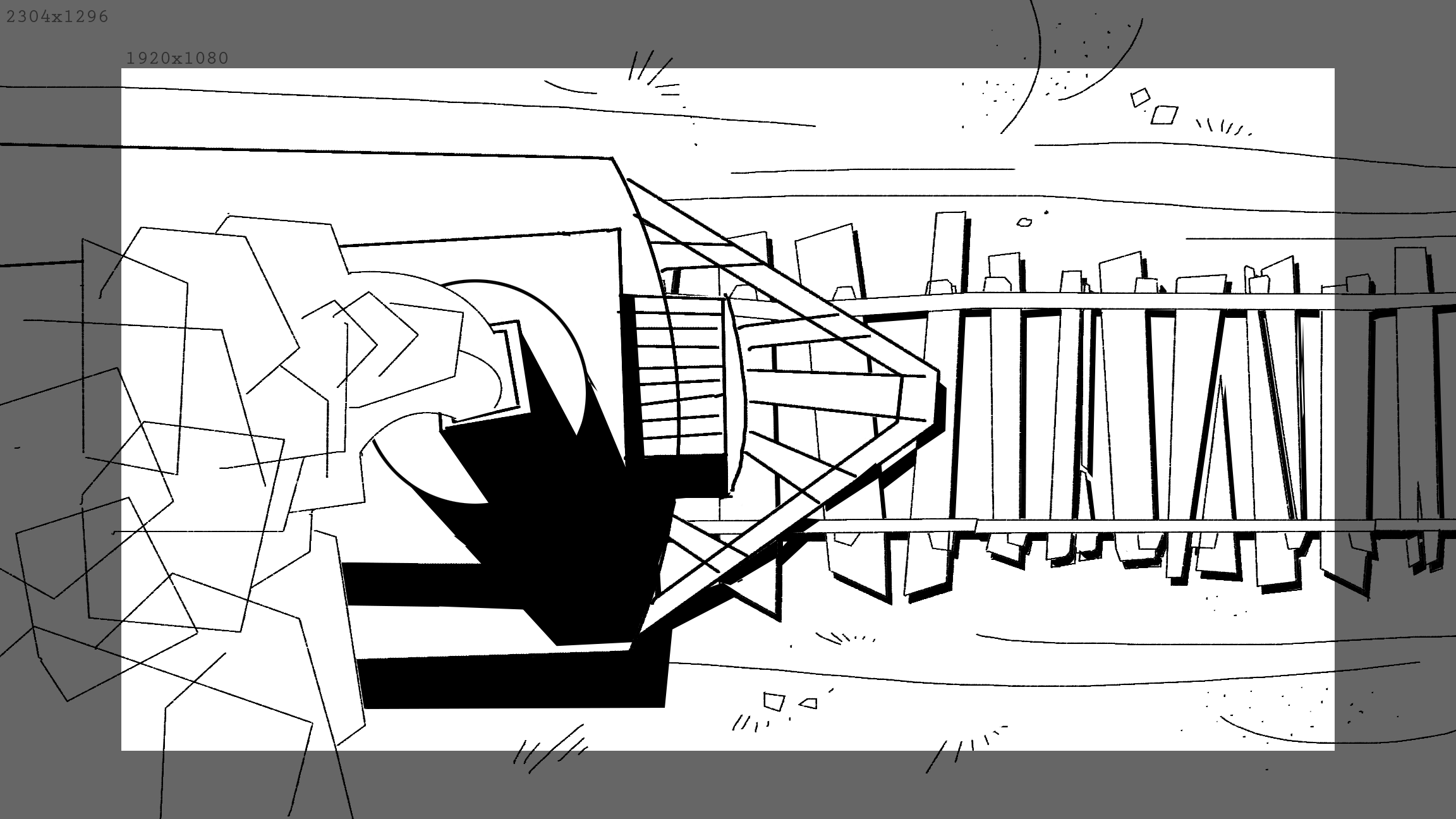
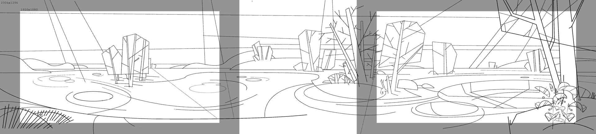
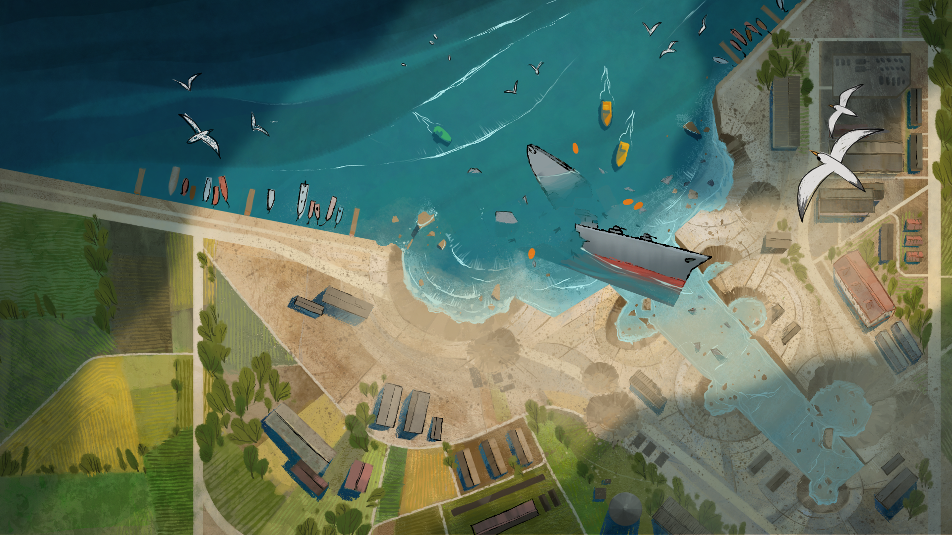
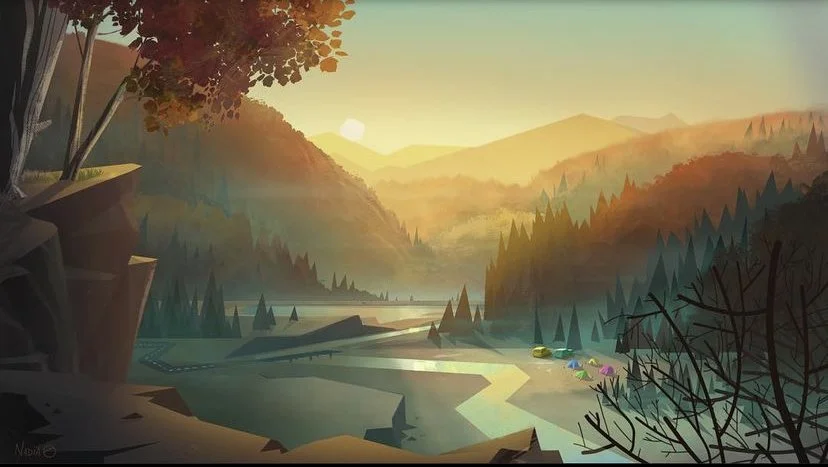
EARLY CONCEPT PAINTINGS
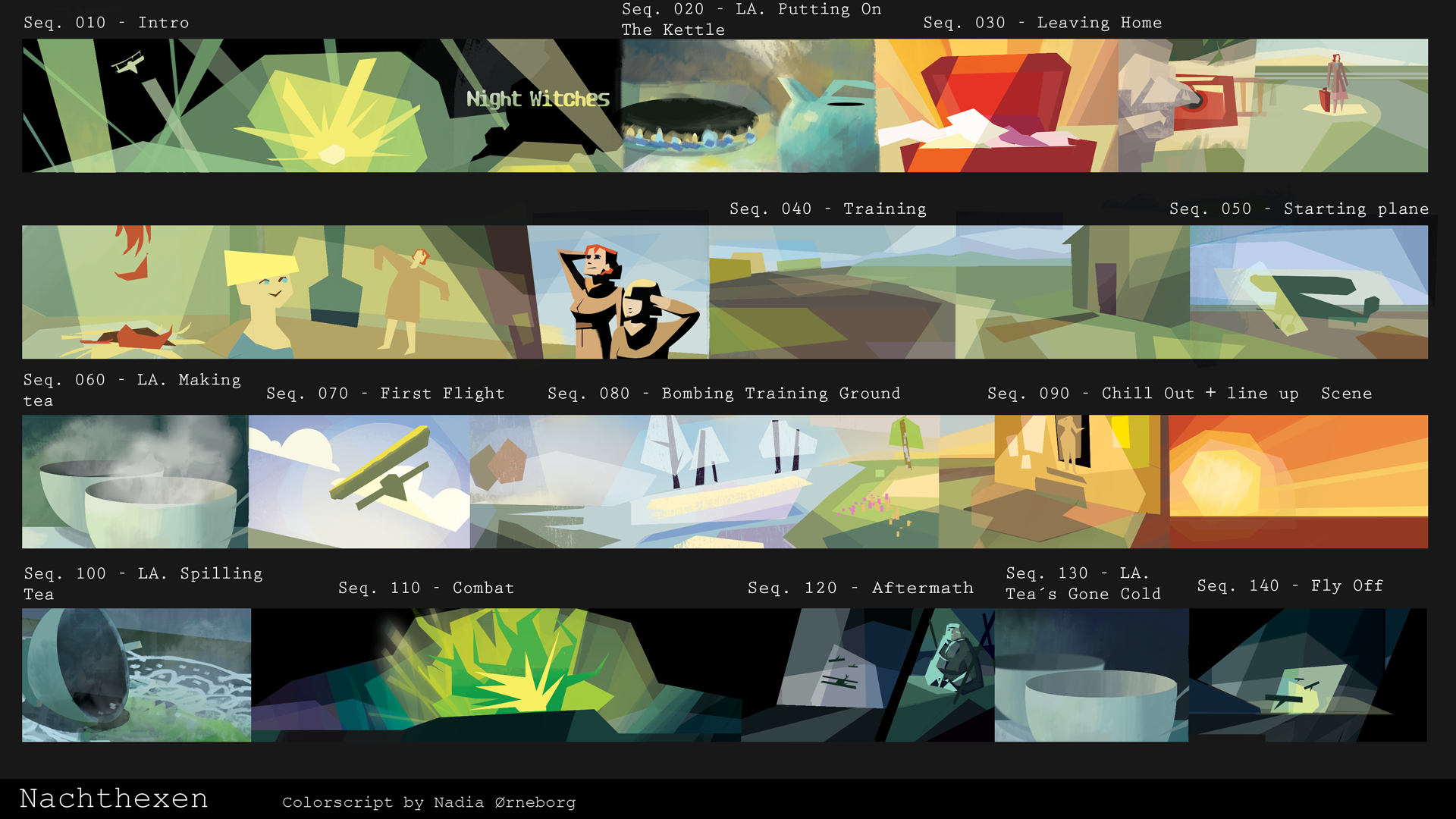
COLOUR DESIGN
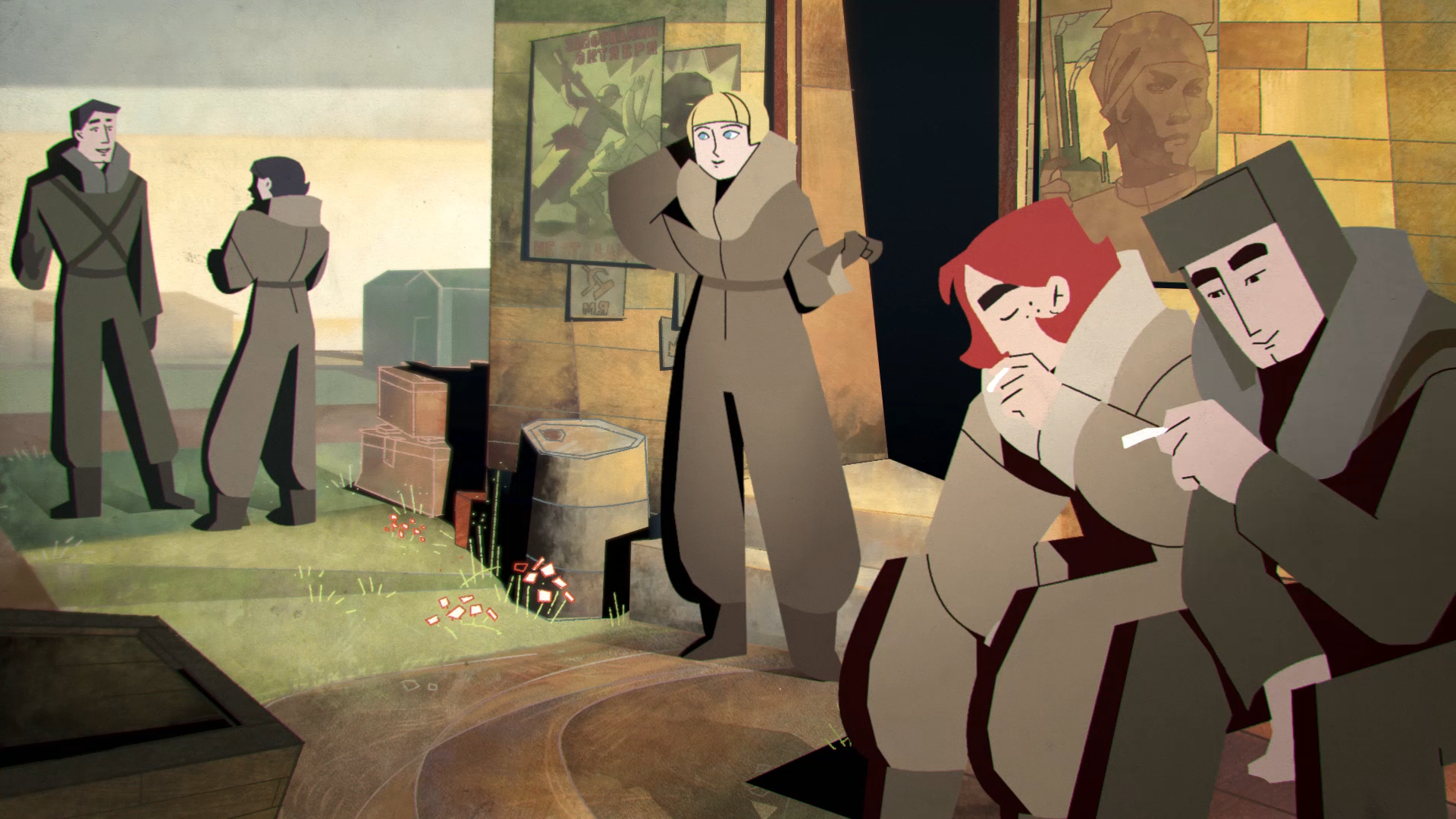
The colours are an important part of any storytelling. We used red to symbolise the propaganda & ideals of the characters.
Making the main character have red hair is a part of this symbolism. She is the model soldier, the one her co-pilot looks up to and a protector. The moment she dies in the film is the moment her co-pilots ideals die too. At the same time the mood shifts and the viewer is faced with a grueling realisation.